
General Assembly UX Project
PandemApp: The App We All Need.
Preface
In March 2020, everyone was shocked at the epidemic that plagued the world: Coronavirus a.k.a. COVID-19. Many lost their jobs, and many gravitated towards working from the comfort of their own homes. The uncertainty of what would happen with this unknown virus caused many anxiety and stress in daily life. Almost 2 years later, the pandemic still affects our daily lives. With this in mind, I knew there was need for a solution to make everyday life more easier, while still staying safe.
In December 2021 I had the opportunity to take a class with General Assembly for UX Design. Through this course, I was able to learn the whole lifecycle of creating a visual product from start to finish. This course has allowed me to learn the several intricate processes that go into creating the design for a product, and I have thoroughly enjoyed every part. After the completion of the course in February, I finalized my product: an app called PandemApp which will help thousands of people currently living through a worldwide epidemic.
Discovery and Research
During the discovery and research phase, I was able to sit down and reflect on the current issues plaguing our population, and what I could possibly create to make these issues easier to deal with. After evaluating the most pertinent issue, which today is the COVID-19 Coronavirus pandemic, I knew there had to be something I could do to make life easier for everyone. In a time where everyone is constantly worried about wearing masks, hand sanitizer, and social distancing, the need for an app to help people be more safe while running daily errands was vital. This revelation motivated me to create a series of questions to ask several different types of people in user interviews.
User Interviews
During the User Interviews, I asked a series of different questions to my interviewees. I also made sure to work with people from many different walks of life, in order to fully understand how I can create a solution to help the majority of the population. As we are all living through a pandemic, I was able to conduct FaceTime interviews with most people, and face to face interviews with some. I recorded these videos in order to further analyze them.
In the interview, I started with a rough outline of questions to ask, but often would tailor the questions more to the participants responses. These questions began like "How are you feeling living through a pandemic?" and "What has changed in your daily routine?", and then turned to "What can be changed to make you feel more safe?". These questions allowed me to gain insight into the struggles that so many people face daily living through this trying time. On the right is a video from a user interview I conducted, where the participant reflects on how the pandemic affects his daily life.
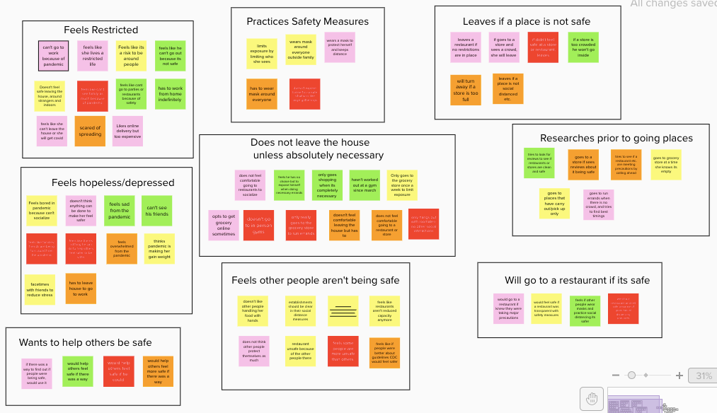
Affinity Map
In order to better gain insight into the interviews, I created an affinity map to synthesize and organize the many ideas and comments I gathered during the interviews.
As shown in the Map on the right, it is evident that there are several similar sentiments that many of the interviewees held. Many people try to avoid leaving the house unless absolutely necessary, while simultaneously, many people feel very hopeless and depressed.
Taking these several different observations in mind, I recognized I wanted to create a solution to help keep people safe, while also allowing them to safely leave the house to get groceries or to enjoy a meal at a restaurant.
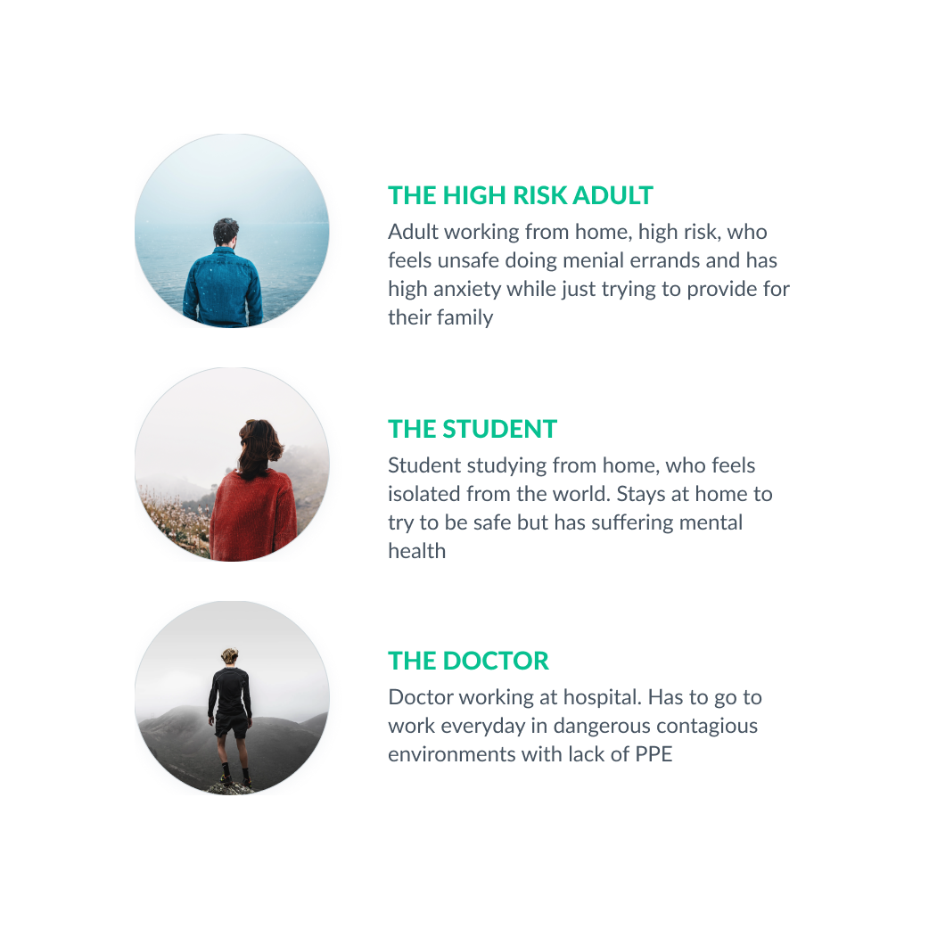
User Personas
Based on the interviews/workshop I set up three personas. I referred to them throughout the entire product development process.
These personas were created from a consensus of the several user interviews. It became evident that although these three personas all had the same goal in mind; to stay safe from COVID-19, they all had different perspectives while living through a pandemic. Studying these personas allowed me to try to cater features to the app to help accommodate to each persona's different needs.
These personas will be used when usability testing is performed, in order to see what parts of the app are most useful and usable to each persona, and which features are perhaps preferred over others.
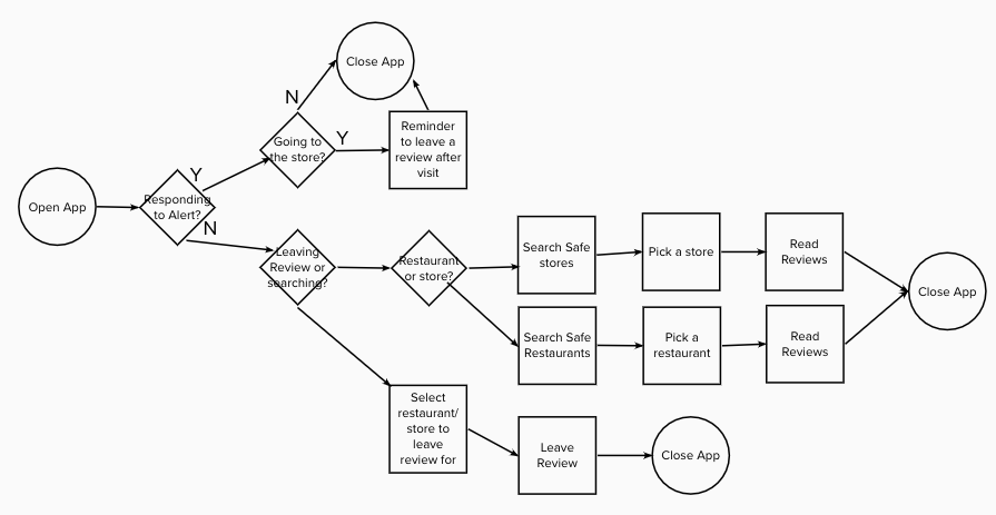
User Flow
The user flow was used to map out how exactly a user might interact with the app. This allowed me to realize how many interactions it would take a user to find the information they need, and how easy or hard it was to navigate the app. While my initial user flow is a rough indicator of how the real product will be, it was a useful tool to see the numerous ways a user could interact with the app.
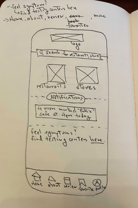
Sketches
I began the actual design process for this application by creating low fidelity wireframes by sketching on paper. Doing this allowed me to determine the actual functionality of the application, and what features the application would provide to the user. Creating sketches also allowed me to narrow down how the app will provide an effective solution to helping people to remain safe in a pandemic.
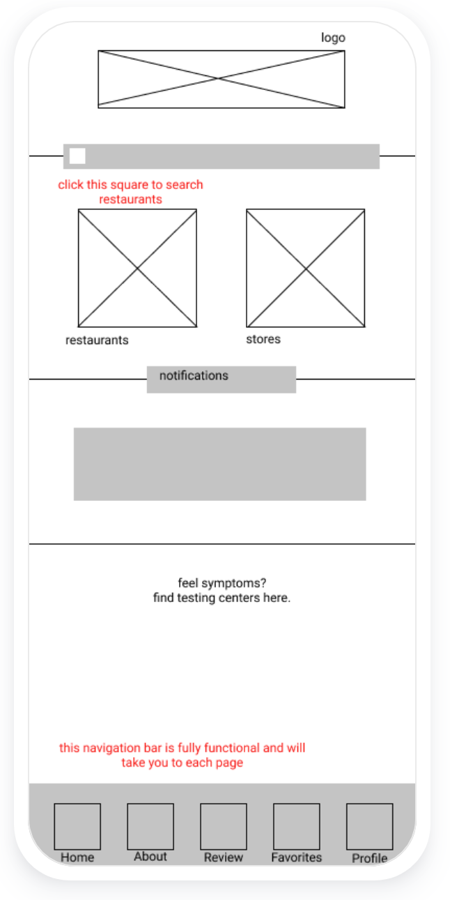
This home screen sketch shows a navigation bar at the bottom as well as several other components. The user should be able to search restaurants or stores near them, as well as see which places have a good "safe" rating, and which do not. They are also able to find COVID-19 testing centers if they do happen to feel symptoms, so they can keep themselves and others safe.
After sketching, I was able to better have a vision of how I wanted this app to be laid out and how a user would navigate through the numerous screen.
Wireframes
From the sketches, I was able to digitize my work in order to create useful wireframes. These wireframes further allowed me to modify and develop how I would like the application to look to the user.
After creating several wireframes, as well as a workable prototype, I can then proceed to make a more high fidelity mock-up that will be a more accurate version of how the app should appear to be.
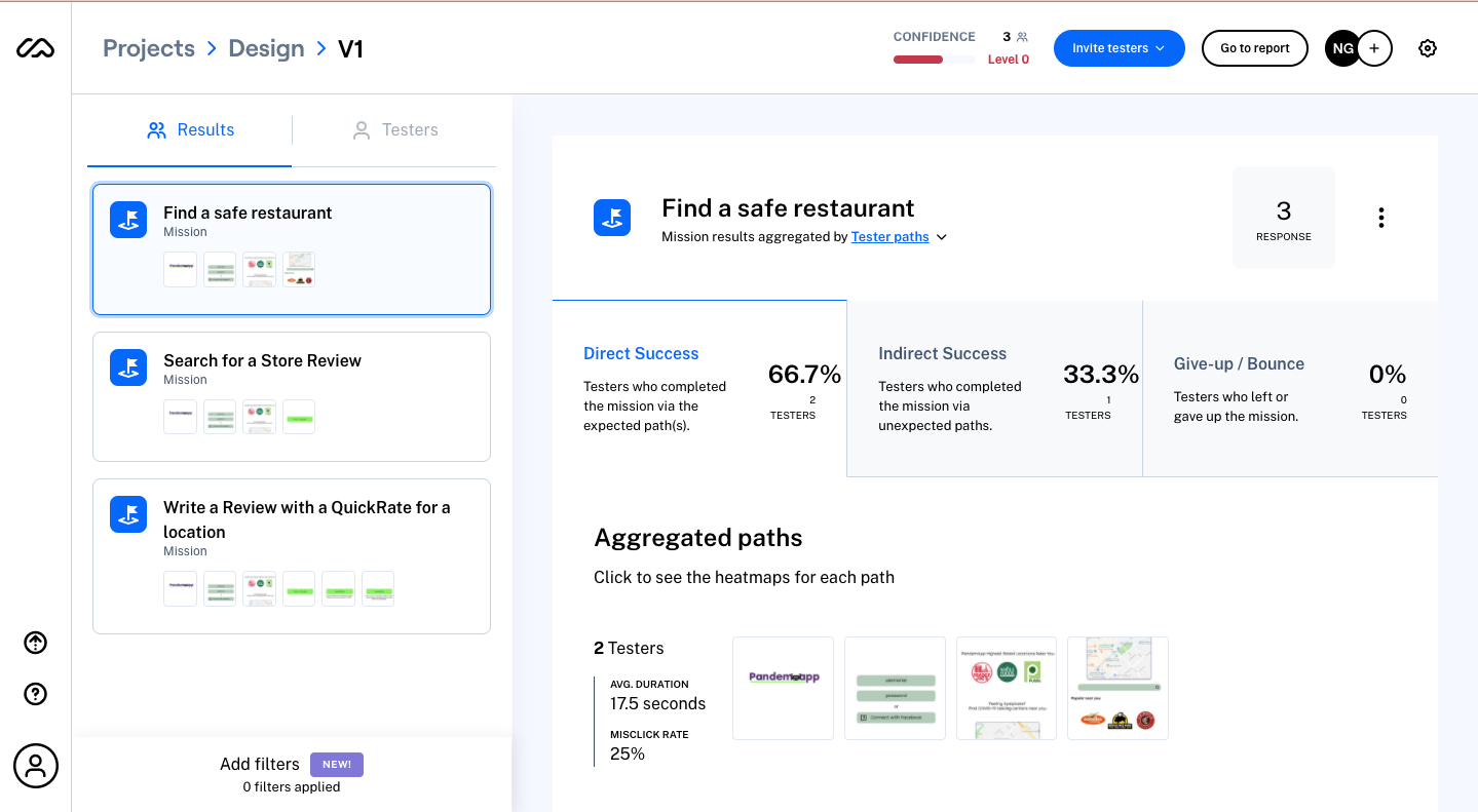
Usability Testing
After creating my initial low- fidelity prototype that showed the basic functions of PandemApp, I ran several rounds of Usability Testing. Through this testing, it became evident that navigating the application was not as easy to the user as intended. This allowed me to rethink the entire application and how exactly users could fully utilize the application efficiently and effortlessly.
This was a major milestone in the design development process, as if the user did not find the application to be easy to use, they would probably avoid using it. My mission was to create an easy, smart application to help users feel safe in this scary and anxiety filled time. The use of the application should come easily and intuitively, and after usability testing, I was able to finally achieve that.
UI Design
Once I tested out all usability mistakes, I was able to design the final prototype in Figma. I decided to follow a light, fresh visual style to promote optimism and cleanliness in a time where many may be stressed about day to day life.
I created an initial style guide with fonts and themes and followed this throughout the application for consistency. This enabled the application to flow and gain more visual appeal and aesthetic.